FFXIV Backstage Investigators (No. 4): Lead UI Artist Yoichi Seki
Backstage Investigators
Hello everyone, this is Miyamiya from the Promotional team!
FFXIV Backstage Investigators is a blog series that share behind-the-scenes stories from the team members who work on all aspects of FFXIV.
The subject of our fourth interview is...
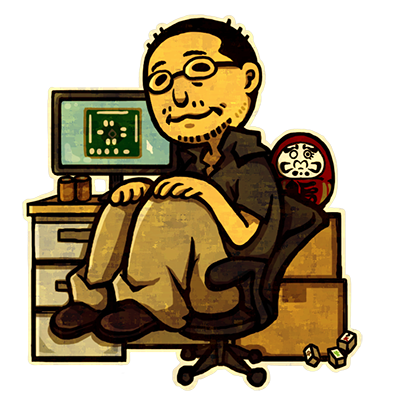 As a UI Artist, Seki goes above and beyond so that we can enjoy our time in Eorzea as smoothly as possible!
So without further ado: Investigators, move out!
Miyamiya: First, please introduce yourself to our readers!
Seki: My name is Yoichi Seki, and I am the Lead UI Artist of the FFXIV team.
Miyamiya: What do you work on as a UI artist?
Seki: When you think of the term "UI artist," your first impression may be that our work is limited to menu windows, icons, and gauges. But actually, UI artists are in charge of much more, including the title menu, credits, loading screens, 2D maps, minigame menus for seasonal events, Doman mahjong, and the cards for Wondrous Tails and Kupo of Fortune.
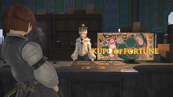
We even work together with UI Designer Kei Odagiri on the Group Pose feature. Since UI artists work on a wide range of features, we often coordinate with other groups outside of the UI team, such as the Event team, Effects team, Character team, and Live team.
Miyamiya: You're right! When I think of "UI," I think of those various system-related conveniences that are added with each patch. But in fact, UI artists were involved in a great variety of different features! I believe you also design the icons for actions. In particular, the blue mage actions added in Patch 5.45 have especially vivid and detailed icons. Was that done intentionally?
Seki: We're very meticulous with designing the action icons. That said, the blue mage icons were requested to be displayed larger than usual, since they would appear in the Blue Mage Log.
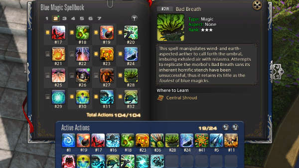
Hearing this, the staff member who designed the original blue mage icons was gracious enough to make the illustrations a little more vivid than usual. The results were quite eye-catching, and since then we've continued to give blue mage icons a little extra flair.
Miyamiya: So that's why they look a little different from other action icons! As a collector, it scratches an itch when the Blue Mage Log gradually fills up with new learned actions.
When it comes to icons in general, is there anything you're particular about when creating them? Do you have any personal favorites?
Seki: I personally emphasize recognizability and ask other staff members to keep that in mind as well. Making split-second decisions in the heat of battle would be more difficult if you had multiple icons that all look similar. Notably, healer jobs tend have a lot of sparkly actions, so it can be hard to make each icon look unique. My personal favorites are astrologian's action icons, which I believe are quite pretty.
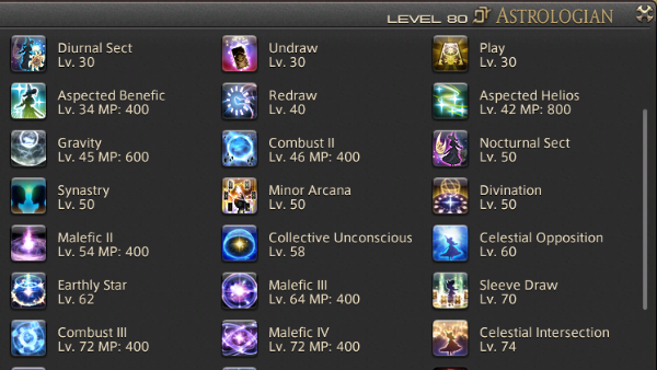 ▲ Astrologian action icons. Many of them are detailed with a multitude of stars.
On a slightly different note, action icons used to be created at a smaller data size since they weren't intended to be displayed at higher resolutions. So when we began talking about displaying them on the Lodestone, we asked the Lodestone team to process each of them and display them a certain way so that they wouldn't be blurry when they were enlarged. Nowadays, there are an incredible number of actions, so we create action icons at a larger size to begin with.
To tell the truth, we had a complete overhaul of action icons in late 2019 in order to keep up with current trends of higher resolutions.
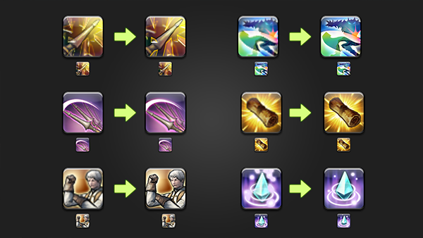 ▲ Here are some before and after comparisons. If you compare the smaller versions together, you really can't tell the difference!
Miyamiya: What!? You really did that!? I hadn't noticed at all!
Seki: Making drastic changes to the icons' appearance would confuse players, so we were very careful to remake the icons to look the same when displayed in-game. Our staff members worked really hard on it, and now they're much larger in data size.
With the upcoming PS5 version of the game, we'll have to make everything compatible for higher resolutions. However, we can skip the action icons since we've already finished them, and work on other aspects instead. I'm glad we worked on them earlier. (laughs) I mean, there are about 3000 icons just for actions alone.
Sometimes, there were cases where I opened up a file and couldn't tell what action it was supposed to be! (laughs) I had a good look at how the action icons were comprised when I joined the FFXIV team. Medica II stood out to me in particular because of its cute pink color, but when you look closely, you can tell that it's actually four silhouetted figures with a staff in the center. I primarily play white mage, but that was the first time I realized what the icon actually depicted. (laughs) The staff members and I had a good laugh over that.
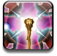
▲ Medica II's icon. I also originally thought that the icon was supposed to be a flower or something, with a branch in the middle surrounded by petals.
Miyamiya: Now that you mention it, I'm sure there are still icons I haven't fully understood. (laughs)
Next, I'd like to ask about one of the Custom Deliveries clients, Ehll Tou. I was really surprised when I heard a rumor that her signature shown in the UI changed over time. What were your thoughts when implementing this feature?
Seki: I also saw the social media posts pointing out that Ehll Tou's signature changes with each stage. I was both happy and impressed that players had noticed such a minor detail.
We've been putting in some fun easter eggs in the Custom Deliveries UI since the first client, Zhloe Aliapoh. If you look carefully, you'll find scribbles by her younger sister Khloe, or stickers you may recognize from Wondrous Tails. This was suggested by the staff member in charge at the time. We thought it was fantastic, and while we haven't done it for every client, we've added some little tidbits for several of them.
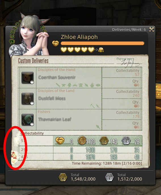
As for Ehll Tou, we knew that she'd be growing over the course of three stages during the story, so we decided to add something to indicate her progression. As a result, we came up with something like this.
・ At first, her attempts are clumsy. Her signature looks more like claw marks and the paper is a little torn too.
・ During the second stage, she gets better at making the markings look more like letters.
・ During the final stage, the story shows her using tools skillfully, and she's able to write words correctly as well.
That was how we depicted the change over time. Ehll Tou is the only client so far that changes with each stage, so I hope you'll check out her Custom Deliveries if you haven't already.
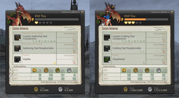
▲ Ehll Tou's first and second stages, which you can't see once you've progressed beyond them. We hope you'll progress and see the third stage for yourself!
Miyamiya: Sounds like there are a lot of other hidden elements that I haven't noticed! I have to go see everyone again!
Next, I'd like to talk about job gauges. Nowadays they're pretty much essential, but job gauges weren't added until Stormblood. What did you have in mind when designing them?
Seki: It all started when the Battle System team came to us to talk about adding a new gameplay element. The UI artists brainstormed designs to match each job and decided on a direction from there. We also had Producer and Director Yoshida take a look as we narrowed it down, then began making the actual data and putting the internal system together. That was really hard. (laughs)
There are an enormous number of things we have to keep in mind when creating the job gauges; how they should work, how to differentiate them from other HUD elements, sections that light up to indicate stances or how many stacks you have, effects like the glow effect when your gauge is full, and more. We worked together with the Battle System team and carefully examined minute details, such as the animation of the gauges filling up or how easy it was to visually recognize that the gauge was glowing. There were numerous points that we needed to consider, and so many elements that we had to implement. I think it may have been the most difficult task I ever had as a UI artist.
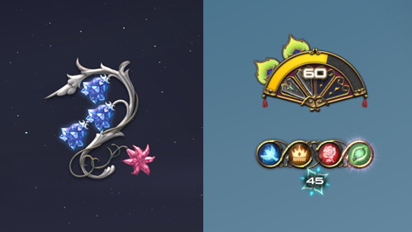
▲ Job gauges for white mage and dancer. Each job gauge is designed so that stacks and accumulation rate can be discerned quickly. They're quite pretty too!
Even so, all the UI artist members are passionate about FFXIV and they were interested in working on the job gauges, especially for the jobs that they played. Everyone is quite experienced with the game, which really helped when it came to incorporating the necessary elements into a tangible design, and I think they were able to come up with exceptional results. I've personally leveled all the jobs to 80, and I really believe that it's important to play and have passion for the game.
Miyamiya: I see, the job gauges were successful because the UI artists had a very deep understanding of the game.
I'd like to hear about what stood out to you the most out of everything you've worked on.
Seki: Creating the UI for YoRHa: Dark Apocalypse was memorable to me.
I was the one who created the UI for YoRHa: Dark Apocalypse. I had already spent a lot of time playing NieR:Automata when I heard about the crossover. As a player of the game myself, I never thought I'd get to work on a related project, and I remember being extremely excited. The topic of recreating NieR:Automata's UI within FFXIV came up in our discussion with the Event team, which led to creating the Portable Archive.
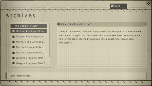
▲ The Portable Archive's UI. Even the animation when it opens up is just like NieR:Automata!
When YoRHa: Dark Apocalypse was released, I saw comments on social media like, "I was expecting the usual UI when I opened the Portable Archive, so the NieR:Automata UI really caught me off guard!" When I read that, I felt "Yes, I did it!" and "I never thought I could move people with UI!"
People tear up when they hear beautiful music or experience a wonderful story, but when it came to UI, I was always under the impression that reactions were more mundane, like "It's easy to navigate," or "It matches the theme." Of course, compliments about YoRHa's UI are often based on the wonderful game that is NieR:Automata, but recently we've received more and more compliments about the UI art, and now I feel that we've been able to reach people's hearts through the UI.
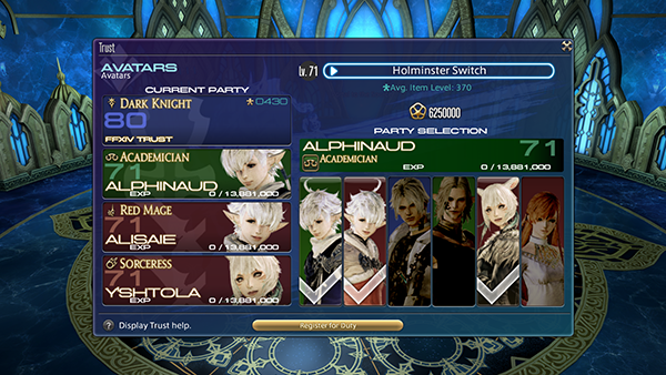
There are all sorts of unique individuals in the UI artist team; some are great at making cute or fancy designs, whereas I have confidence in systematic UIs such as those for the Trust System or Doman mahjong. I'd like to continue to incorporate our specialties and create UIs that remain in players' hearts!
Miyamiya: And now for our usual question about your tools of the trade! Is there anything you simply can't work without, carry everywhere with you, or find useful?
Seki: For me, it's the Elgato Stream Deck. I read a web article last year that introduced all sorts of handy things for playing FFXIV, and this device was one such item.
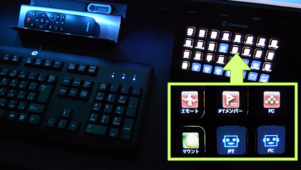
It allows you to assign hotkeys to the buttons on the device, and you can also create macros that execute multiple commands with one button. There are other devices that can do this, but a major feature of the Elgato Stream Deck is the LED display that shows an icon for each of the buttons.
At work, I use this to switch between tools and to execute macros in Photoshop. You can combine multiple actions or commands together so it's extremely useful. I can't show you the one I use for work, so here's a picture of what it looks like when I'm playing FFXIV. As you can see, there's a small icon for each button. You can have it display action icons to have a physical version of your hotbars in real life! This is where I move my shortcuts when I need to conserve space on my in-game hotbars. Of course, you can even switch multiple layouts, so you could even toggle between button layouts for battle and crafting, for example. It's been extremely convenient ever since I first bought it, and I put it to use all the time for both work and personal use.
Miyamiya: Do you have any parting words for our readers?
Seki: I also play FFXIV every day, and it's truly a lot of fun even now. I was part of the FFX-2 and FFXIII development teams, and I didn't play FFXIV until a little later in A Realm Reborn. It was just so much fun when I tried it out, and I ended up joining the team in Heavensward. I've played many of the numbered FINAL FANTASY titles, but FFXIV has a special place in my heart. It goes without saying that I was playing yesterday too, and I get a lot of motivation to work just from playing the game. Sometimes when I'm playing, I'd be like, "I wonder what it'd be like if I added this to the game." (laughs)
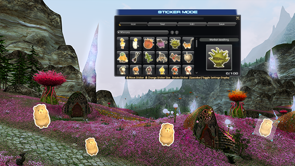
Recently there have been a lot of positive comments on social media about the UI, and I'm truly grateful. The most recent ones would be comments regarding group pose, about how the doodle stickers are cute and how the feature has gotten easier to use. There have been a lot of players who have enjoyed the UI artists' work, and seeing those comments is truly inspirational! Please continue to let us know what you think on social media.
Finally, now that I know that we can move players with the UI, I'd like to continue to create all sorts of amazing things! I hope you'll continue to enjoy FFXIV.
How was our interview with Lead UI Artist Yoichi Seki?
We'll see you next time!
★Previous Editions of FFXIV Backstage Investigators★
・ (No. 1): Main Scenario Writer Banri Oda
・ (No. 2): Lead Level Designer Arata Takahashi
・ (No. 3): Web Director Hiroyuki Takachi
Miyamiya
- Promotional Team
Search Blog
Search by Category
- Information (337)
- Event (167)
- Backstage Investigators (17)
- Lyrics (29)
- Other (44)
- Merch / Goods (42)
- Promotion (15)
Monthly View
Select Month
- March 2026
- February 2026
- January 2026
- December 2025
- October 2025
- August 2025
- July 2025
- May 2025
- April 2025
- March 2025
- February 2025
- January 2025
- December 2024
- November 2024
- October 2024
- September 2024
- August 2024
- May 2024
- April 2024
- March 2024
- February 2024
- January 2024
- December 2023
- October 2023
- September 2023
- August 2023
- July 2023
- June 2023
- March 2023
- February 2023
- January 2023
- December 2022
- November 2022
- October 2022
- September 2022
- August 2022
- July 2022
- June 2022
- April 2022
- March 2022
- February 2022
- January 2022
- December 2021
- November 2021
- October 2021
- September 2021
- August 2021
- July 2021
- June 2021
- May 2021
- April 2021
- February 2021
- January 2021
- December 2020
- November 2020
- October 2020
- September 2020
- August 2020
- April 2020
- March 2020
- February 2020
- January 2020
- December 2019
- November 2019
- October 2019
- September 2019
- August 2019
- July 2019
- June 2019
- May 2019
- April 2019
- March 2019
- February 2019
- January 2019
- December 2018
- November 2018
- October 2018
- September 2018
- August 2018
- July 2018
- June 2018
- May 2018
- April 2018
- March 2018
- February 2018
- January 2018
- December 2017
- November 2017
- October 2017
- September 2017
- August 2017
- July 2017
- June 2017
- May 2017
- April 2017
- March 2017
- February 2017
- January 2017
- December 2016
- November 2016
- October 2016
- September 2016
- August 2016
- July 2016
- June 2016
- May 2016
- April 2016
- March 2016
- February 2016
- January 2016
- December 2015
- November 2015
- October 2015
- September 2015
- August 2015
- July 2015
- June 2015
- May 2015
- April 2015
- March 2015
- February 2015
- January 2015
- December 2014
- November 2014
- October 2014
- September 2014
- August 2014
- July 2014
- June 2014
- May 2014
- April 2014
- March 2014
- February 2014
- January 2014
- December 2013
- November 2013
- October 2013
- September 2013
- August 2013
- July 2013
- June 2013
- May 2013
- April 2013
- March 2013
- February 2013
- January 2013
- December 2012
Search by Tags
- All Saints' Wake
- April Fools
- Backstage Investigators
- Breaking Brick Mountains
- Collaboration
- Community Spotlight
- Crossover
- Dev. Insight
- Elunia Arlana
- Fan Festival
- Fan Gathering
- FF16
- FFXVI
- Hatching-tide
- Heavensturn
- Housing
- Information
- Little Ladies' Day
- Live Event
- Livestream
- Lyrics
- Make It Rain Campaign
- Merchandise
- Monster Hunter Wilds
- Moonfire Faire
- PAX
- Report
- Seasonal Event
- Starlight Celebration
- THE PRIMALS
- The Rising
- Update Details
- Valentione's Day
- Yo-kai Watch


